I have just completed Are we free now? the third work in the sequence of sculptures I’m calling Eternal Vigilance. It is the most brightly colored of the works so far. I’ve been making deliberate color choices for the yarn in these sculptures. In sculptures like the Green Herons in Gerrymandering the Marsh, I used yarns that echoed the colors of the birds that populated the narratives. This time I have been looking for colors that reinforce the concepts underlying the work.
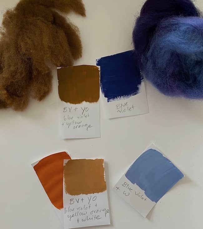
using paint swatches to choose colors of wool for spinning yarn
This sequence of works springs from my reflections on a situation my parents faced in the 1950’s when a friend of theirs was falsely accused of anti-American activities. Their decision to write a letter of support for their friend and possibly jeopardize their own livelihoods must have been a weighty one. It led me to think about how oppressive governments impose restrictions on people, starting subtly, and increasingly demanding conformity. I wrote about it in a prior blog post. The pressure to acquiesce can be debilitating, making resistance ever more difficult.
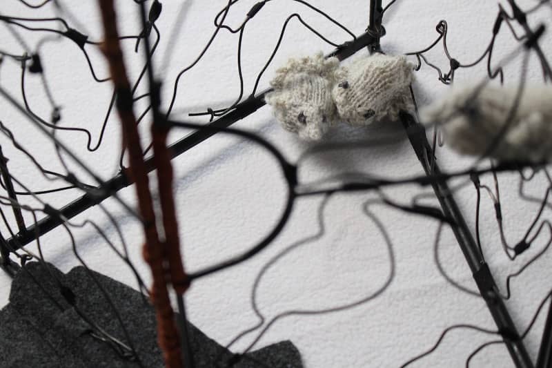
As I developed the narrative that runs through this series I realized there was a parallel with the symbolism around the Passover narrative. During the Passover seder meal, when the story of the deliverance from oppression under the Pharaoh in Egypt is told, four cups of wine are drunk. The significance of the four cups can be explained as: awareness, struggle and redemption, gratitude, and hope. These themes show up in this sequence of sculptures. For example, the first work is called We didn’t recognize the danger. The small birds huddle in the corner of an enclosure adorned with avian images. A shadow crosses their space as they begin to realize they may not be safe.
The birds are a dull, muted gray, drained of life. That was my first color decision.
We didn’t recognize the danger, 15 x 24 x 16 inches, wire, metal frame, wool, rigid foam, felt, cloth tape, rattan, ©2023 Eve Jacobs-Carnahan
Using color to reinforce concepts in artwork
As the sculptures progress through the story, I have purposely chosen colors to reflect the themes: awakening, tension, confusion, comfort, coherence, or enlightenment. I an excited by the ways color can reinforce the concepts underlying the sculptures. It leads me to ask: what colors create tension and convey uncertainty? What color combinations suggest a sense of awakening? Are there colors that might express comfort and settled agreement? In these sculptures relating a the progression from awakening to freedom, the colors can support the story line.
To deepen my understanding of color, I am working through the exercises in David Hornung’s book Color: A workshop for artists and designers. I do the exercises in paint, as it is much faster than blending colored wool. In a matter of seconds, I can see the effect of mixing colors. Once I find colors that support my ideas, I card and combine batts of different colors of wool, using the paint swatches as a guide. The blending principles are the same: add white or a dark chromatic grey to change the saturation and value of a color. Add a bit of a complementary color to mute a color without changing the value. Mix a rainbow of secondary and tertiary colors from three primaries plus white and all will harmonize.
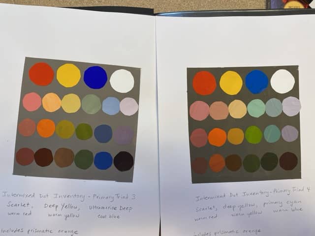
color mixing study from David Hornung, Color: A workshop for artists and designers
Choosing colors to communicate themes in artwork
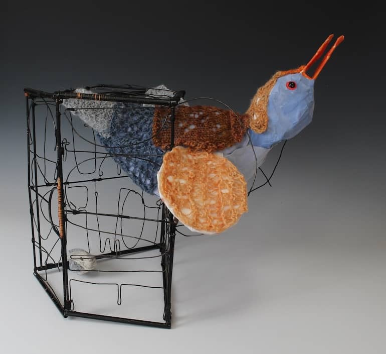
In Courage is the path to freedom, the color choices were pretty straight-forward. My intent was to bring life back to the bird as it breaks through the barrier of the cage. The dullest colors, chromatic grays, are on the parts of the bird that are still inside the enclosure. The wing and head that have broken through the metal fence are rendered in gradually more saturated colors of orange and blue.
Courage is the Path to Freedom, 18 x 20 x 18 inches, wire, metal frame, handspun wool yarn, cotton fabric, rigid foam, mulberry paper, stone clay, rattan, acrylic paint, screws, © 2023 Eve Jacobs-Carnahan.
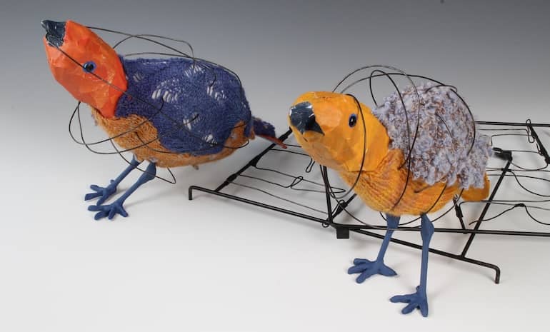
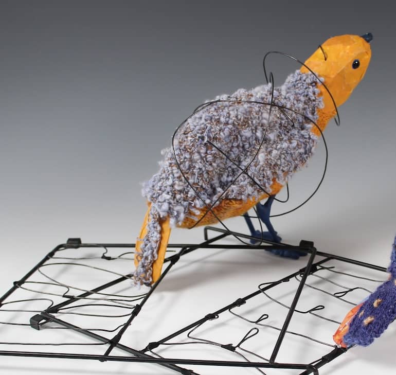
In the third work, my choices of color are more nuanced. My goal was to convey tension and confusion. I feel a disorienting pull between the curly pale blue violet yarn and the slightly jarring yellow orange of the bird’s belly. The two colors are close in value on a gray scale, so they compete for dominance.
Are we free now? (detail) 10 x 20 x 23 inches, wire, metal frame, handspun yarns, rigid foam, cloth tape, mulberry paper, stone clay, acrylic paint, screws © 2024 Eve Jacobs-Carnahan.
The breast and belly of the companion bird uses those same colors. The dark blue violet back of the bird is much darker in value than the belly, so it dominates. This reduces the tension. In reality, there is a unifying tone to all these colors because I mixed them from three base primaries and white. If I had wanted a more unsettled feeling, I could have altered the base colors for the blue and orange to create more tension.
The next work in this narrative sequence will have a bird (or two) with a nest, making a commitment to life anew. My idea is to use harmonious colors, close in hue, value, and saturation. I’m experimenting with medium to deep blue, blue violet, and violet.
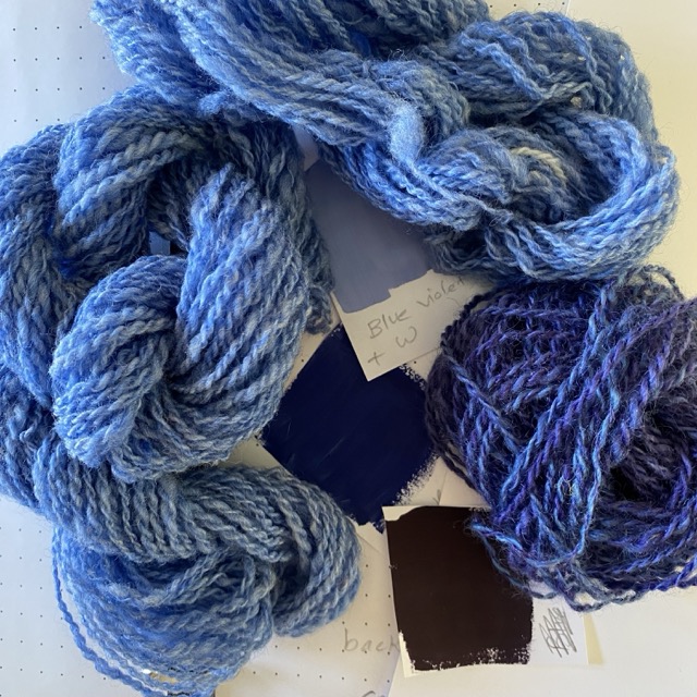
considering blue, blue-violet, and violet paint swatches and yarns in narrow value range for sculpture color scheme
You can see all the works in this narrative sequence here.
This is powerful in so many ways, Eve!
Thanks, Roz!
I really enjoyed reading and seeing how you’re implementing what you’ve learned in each piece.
Thanks, Betsy. Writing about them helped crystallize what I’m learning too!
Eve, compelling pieces! I loved learning about your color theory studies and relevance in this body of artwork.
Nicole, I’m glad the pieces speak to you.
I love this, Eve! So great to see your thinking and process.
Thanks, Alyson!